 Te Uru Tāngata – our new look
Our new organisation, Te Uru Tāngata Centre for Workplace Inclusion, launches within the next month. We’ve shared the meaning behind our new name and now we want to reflect on the symbolism of our new logo.
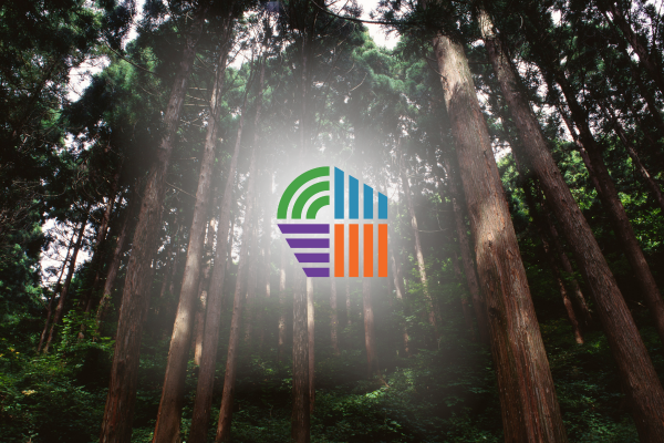
We partnered with Māori-owned, award-winning agency Run to develop our new look. The tohu or mark in our new logo symbolises our name, which translates to a ‘grove of people’,
It’s inspired by the whakataukī ‘Kahikatea tū i te uru’, which refers to the tallest native tree in Aotearoa.
Kahikatea grow in groves forming an intertwined root structure that makes it one of the strongest and most resilient trees in the forest.
Metaphorically, the whakataukī translates to ‘Strength in numbers’ so the name Te Uru Tāngata talks to the strength of people when they work together with a unified purpose and shared beliefs.
Our tohu shows groupings of lines, a collective, growing together in different directions representing the growth of kahikatea. The trunk that grows upwards, the branches that reach out sheltering other trees, and the roots that stretch outwards and intertwine across the forest floor.
The different directions of growth and colours represent diversity and inclusion, aligning with the purpose of Te Uru Tāngata and acknowledging the various groups we work with.
Chief Executive Maretha Smit says, “Our new tohu gives visual expression to who we are and what we represent – people connected through shared purpose, growing stronger together. Just as kahikatea thrive through interdependence, Te Uru Tāngata is about building inclusive workplaces that draw strength from diversity.
“Every element has meaning. It’s a symbol of inclusion, growth and connection – the roots that ground us, the branches that shelter others, the diversity of colour and direction. This design reflects our kaupapa and the communities we serve.”


