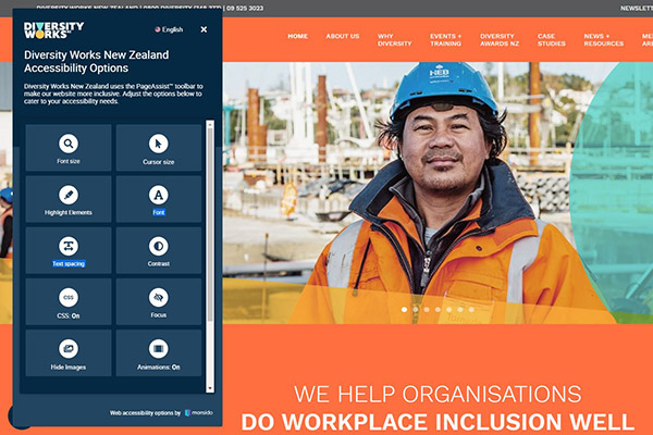
 We are constantly trying to improve the Diversity Works New Zealand website to ensure it’s more usable, especially for online visitors with accessibility needs.
As part of that work, the Page Assist toolbar, which offers visitors more options to better access content and website functions, has recently been upgraded.
You can start exploring the toolbar by clicking on the yellow Page Assist icon at the bottom left of any page of our website, or read more about the toolbar features below.
Font size
This allows the user to enhance the size of the text on the website (125-500%) for better readability, which is especially relevant for people with visual impairment.
Cursor size
Allows the user to switch between normal and enlarged cursor.
Highlight elements
This function has four options to bring more attention to the structure and interactive parts of the webpage. Highlight either links, headings, buttons or all of them at once. Links and buttons allow the user to immediately see which parts of the page they can interact with, while headings draw out the structure and hierarchy of the page.
Font
The user can switch between three font types:
Sans-serif — typically preferred for websites for their clean style and good readability, even on low-resolution displays
Serif — the typical typeface used in books, magazines, and other printed media. Some people are more accustomed to reading long texts in this style
OpenDyslexic — a special font designed to help with some of the symptoms of dyslexia. The font features weighted bottoms to indicate direction and the unique shapes of each letter can help the reader avoid confusion.
Text spacing
Allows the user to increase the space between letters. This benefits people with low vision or dyslexia who might need more space to ease their reading process.
Contrast
The user can switch between three contrast modes:
Dark mode — switches to a dark-background option that for some, especially people with visual impairment, can be less straining for the eyes
Invert colours — inverts colours on the website. Mostly used for increasing text contrast, which can be helpful for people with visual impairments.
Grayscale — removes colours from the webpage. This can be used by people with colour-blindness since it is harder for them to distinguish between certain colour combinations
CSS on/off
Allows the user to turn off CSS altogether, keeping only text. This is especially useful for people who use only a keyboard to navigate.
Focus
The focus feature gives the user two options:
Emphasise — this highlights a horizontal area behind the cursor while dimming everything else. This helps the user to focus on the element they want and removes some of the background clutter of content that might not be relevant
Reading guide — a thin horizontal line following the cursor helps the user keep track of which line of text they are reading
Hide images
Allows the user to hide all the images from the website. This can help remove clutter that for some people make it harder to concentrate on the content they find important.
Animations: on/off
Allows the user to turn off any animated gifs on the website. This feature does not affect video files.
Site menu
This gives the user an overview of the webpage in three options:
Headers — displays the website hierarchy and structure in the form of headers used. The user can click on any header to jump to its location
Landmarks — displays the website hierarchy and structure in the form of landmarks used. The user can click on any landmark to jump to its location
Links — lists all the links on the current page in their HTML order. Clicking on any link opens it
Keyboard navigation
Displays the shortcuts for keyboard navigation inside PageAssist.
Information
A short intro to PageAssist.


